TinyTales,
Big Solutions
Designing a Faster Way for Parents to Find the Perfect Story

For my Springboard UI/UX bootcamp, I completed a design sprint for the fictional startup, TinyTales. I followed a modified version of Google Ventures’ Design Sprint model over the course of five days with research and context provided from Bitesize UX.
Project Context
TinyTales is a tablet app that allows parents to read aloud stories to their children. After interviewing users and creating personas, TinyTales realized parents were spending too much time browsing the book selection and not enough time reading with their children.
The Problem
TinyTales’ biggest hurdle wasn’t a lack of great stories—it was helping parents find them faster. To help parents make faster book selections, I designed a search and filter system to help them narrow down their choices.
The Solution
This design sprint was a solo design project with the guidance of my Springboard mentor. I served as a user experience and interface designer, prototyper, and user tester.
Team and Roles
Day 1: Understand and Map
TinyTales is a startup that provides parents with a library of books to read aloud to their children. However, after conducting some research, they have noticed parents are struggling to choose the just right book to read aloud. A just right book is a book that has an engaging topic, is the right level for the child, is the appropriate length, and teaches the child something. Parents find themselves taking a long time scrolling through books to find one the child is interested in and/or if the book is educational. They then take more time to read the first couple pages to see if it’s appropriate. Then, parents are flipping through the entire book to see how long it is to judge if they have time for it. It appears to be very common that parents using TinyTales have at least one of these time-sucking issues, if not all of them. Parents want to be able to maximize their time reading with their children and minimize their time deciding on what book to read. These struggles are summarized with the created persona, Claire, as seen below.
The Persona

After identifying the problem- TinyTale’s current book browsing is inefficient for parents and children, I sketched two possible solutions. My first idea was a standard filter system. Users get to the browsing page, then click on filters in a certain order to narrow down their options. My second idea was users would create a profile based on usual preferences, then books would be suggested. It is not included in the sketch, but users would create this profile as part of their registration process.
Possible Solutions

Possible Solution 1

Possible Solution 2
Day 2 - Lightning Demos
I took notes on three websites that have an electronic library database. The three sites were Epic!, The New York Public Library, and Renaissance myON.
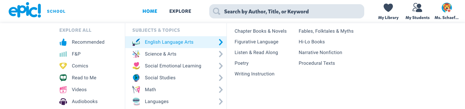
Website 1: Epic!
Epic! is an electronic library database catered both towards teachers in school and parents and kids at home.
On epic, when you click Explore on the top bar, you’re presented with the shown options. There’s lots of different ways to narrow down book options, such as a subject or topic or reading level.
After you choose a topic or subject, you can then narrow your book options down even more, including reading level. Each book thumbnail also shows you how many pages the book is to give you an idea of how long it is.
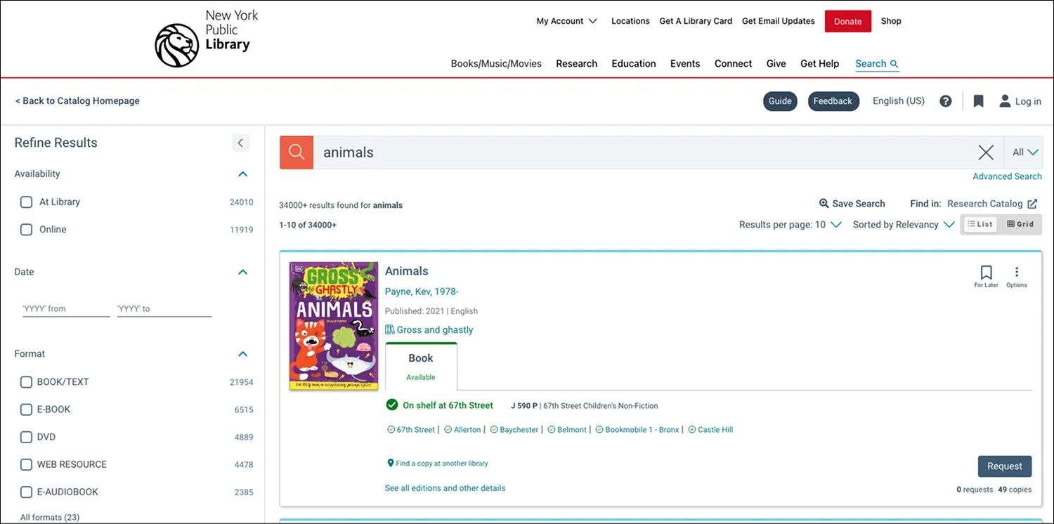
Website 2: The New York Public Library Website
After typing in a topic into the search bar, I am presented with a filter system on the left hand side. There seemed to be no section on the site for me to browse, say, all the different types of animals I could read about.
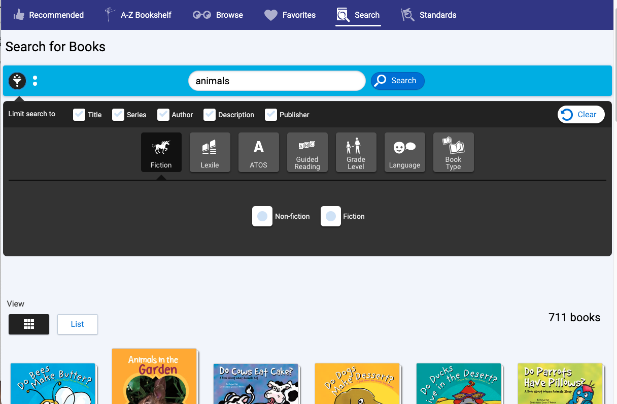
Website 3: Renaissance myON
myOn is an electronic library database that also produces its own stories. It caters towards both school use and at home use for students. The interface is designed with student-led decisions in mind.
If you search any word, you can click the filter button on the left and have lots of options to help narrow down your search results.
Day 2: Sketches
The most critical screen is the browse page for users. The browsing stage is the biggest hurdle for parents and children because they are spending too much time finding the just right book. The browsing page/system needs to let users filter their selection to meet their criteria and see the book’s key information at a glance, instead of parents scrolling then flipping through books for too long.
Crazy 8 Sketches

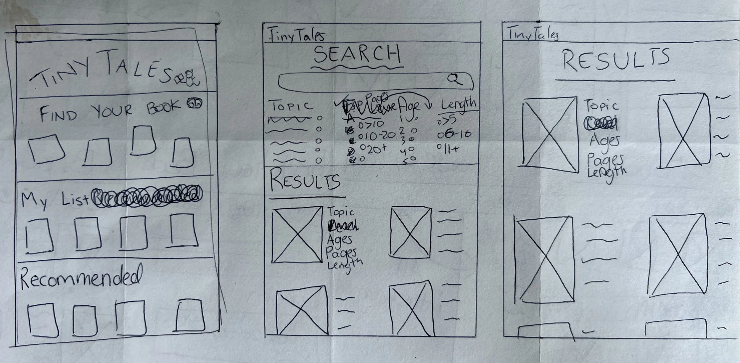
For my solution sketch, I decided to choose a big search bar with filtering options below it. In this first idea, some results would be displayed on the bottom, but i decided the results page would be its own page so it would be easier to focus on just the book options.
Solution Sketch
Day 3: Sketches
For my solution, I decided to combine my first two original ideas from Day 2. In the registration process, parents can add different profiles for each child. Parents will also include their children’s ages so any suggested or searched books include an appropriate age range. I included screen 3 for my parents to choose if they’re reading to just one child or all of them. Some of the parents identified they struggle to find books that work for group reading.
I decided to include a little mouse with a book, because it’s a tiny animal with a tail and would be a cute character throughout the app.
Screens 1 -3
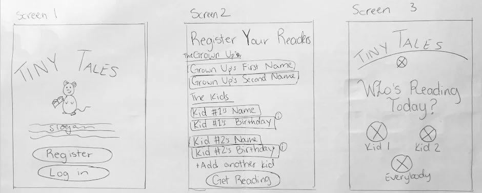
After deciding who is reading, the user is taken to the homepage where they have saved books (my bookshelf) and recommended books (based on ages and previously read books). On the top is a banner prompting the user to browse books to find one to read today.
After clicking the button to browse (Click Here on Screen 4), users can then search a topic, title, or author and filter their results page. After a loading page, the results populate with a small thumbnail of the book cover and some at a glance information (topic, ages, pages, time).
The last screen in my storyboard is the result of the selection. A book taking up nearly the whole screen for the users to read together.
Screens 4 - 8

Days 4 and 5: Finishing it Up
High Fidelity Wireflows and the Prototype
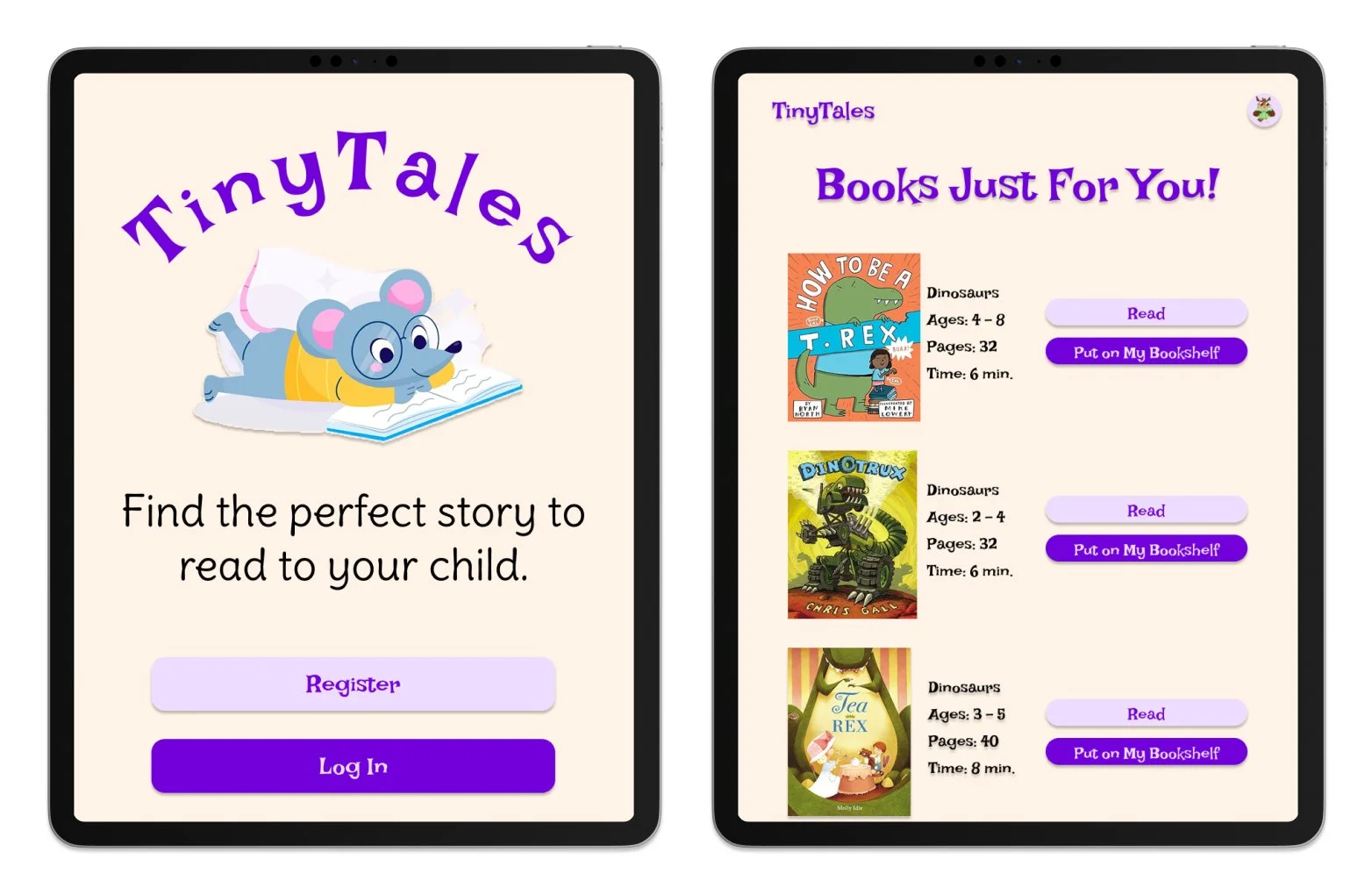
For my prototype, I built mainly the key elements in Figma. I did not add all small details I envisioned in my mind to stay efficient as it is a design sprint. Although the app is designed for parent guidance, I still wanted it to be accessible and engaging to the children next to them.
I decided to keep the font a similar purple to TinyTales original color. For my heading font, I chose Lakki Reddy and for my paragraph font, Delius. Both fonts felt whimsical and fun, but still legible. Lakki Reddy in particular has a classic fairy tale feel, but again is more legible. I changed the icon from the rainbow in a book to a little mouse reading. The mouse character feels more inviting to children who are viewing the app with their parents and can be manipulated in different ways across the app.
As seen on my homepage and following screens, I altered some language to keep with the theme of tales instead of just books. Finding “Today’s Tale” would be how users would browse books. I then decided to include the filter options for pages, read time, genre, and book type. I decided to include both pages and read time to give parents some flexibility when choosing a book. From my own experience as an elementary teacher, children can become obsessed wih the amount of pages they’ve read, regardless of the amount of words on the page. So if a child is insistent they read a 30 page book in school and they want to again tonight, but you as the adult only have 7 minutes, you can set those parameters. I focused my prototype design on the parent being the primary user but allowing for the child to engage and interact too.

User Testing and Results
User Testing
I tested and interviewed 5 parents with young children over zoom. After a conversation about the goal of TinyTales, I asked them all to complete this task:
“Find a made-up story about dinosaurs that will take 8 minutes to read to your 4 year old.”
User Testing Results and Feedback
Every user was able to finish the task quickly and added the filter made it easier to narrow down the books. Although each person was able to complete the task and find the right book. I felt some hesitation in everyone’s voice on the home page when deciding to click, “Start here.” When I asked if about the hesitation, the general answer was they were taking in the whole page and deciding what would make the most sense to look at types of books.
One of the more standout users said she was able to complete the task, but suggested the filtering options came with iconography so the child can be more part of the process or if they wanted to do it on their own.
Wrapping Up
Next Steps
In further iterations of TinyTales, I would develop a more robust color palette based. Additionally, I would design more filtering options, particularly focused on the concept of browsing topics. Potentially users could click browse topics instead of only searching for one. I would also add reading level filtering. In school, students reading levels are usually based on the Fountas and Pinnell alphabet system. Reading level are typically shared with parents so if they could search for their child’s reading level in book options. I would use secondary and primary research to validate these ideas and potentially find even better ones.
Learnings
As a previous elementary grade teacher, children’s reading skills are very interesting to me. This design sprint was challenging due to the frame time, but was engaging and rewarding to finish. I found this project so great to work on, I would love to build this design sprint out more fully in the future.
This project taught me valuable information regarding the process of a design sprint. I analyzed the research provided by TinyTales and built a map of different possible solutions. I then decided on the most important screen and sketched solutions “Crazy 8” style. From there I chose the best solution with the guidance of my mentor. Then finally built out a prototype and user tested. Overall, TinyTales taught me the quick turnaround of a design sprint.

Clothing Recycling Program
A Design Sprint for an iPAD Reading App

Redesign of an AI driven EdTech Program