Making Math More Fun:
A UX Redesign for MyEdMaster
“No other design team I’ve worked with has gone as far above and beyond.”
- Dr. John Leddo, MyEdMaster

As part of Springboard’s UX/UI Design Bootcamp, my final project was the Industry Design Project (IDP). I was paired with two other students, Serena and Andrea, to tackle a real-world problem for a real company, MyEdMaster. As a former teacher, I approached this project with a deep understanding of what learners need and how technology can best support them. Together, we worked on improving MyEdMaster, an AI-powered math tutoring program focused on Algebra I with plans to expand into other subjects. For our scope and sequence, we only needed to provide low fidelity wireframes, but we went above and beyond to include much more.
The goal for MyEdMaster was clear: they needed a more user-friendly design with integrated gamification to stand out in the competitive online tutoring market. Or, as I like to call it, “How to make math more fun, one button at a time.”
Introduction
As an educator, I’m always looking for ways to make learning more engaging and accessible.
In this case, the challenge was clear: how might we create an online math tutoring system that improves upon its usability, increases user engagement, and ultimately raises sales?
The Problem
A consistent and engaging color palette
Increasing user accessibility with clearer font choices
Consistent button sizes, colors, and placements
Reworking question formats and prompts for clarity
To tackle usability, we focused on:
The Solution
To increase user engagement, we implemented:
Gamification of learning through a point system and levels
Rewarding language that keeps students motivated
Breaking up information across screens to keep students focused
Creating a mascot to add fun and personality to the experience
Project Overview
Team
Kathryn Schaefer
Serena Bohannon
Andrea Turrentine
My Role
Market Research
Sketching
Wireframes
Prototyping
Usability Testing
Tools
Figma
Google Docs
Timeline
40 Hours
Research: The Deep Dive into Digital Learning
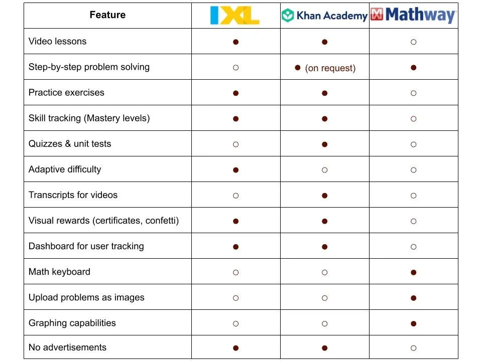
My background as an educator made me uniquely suited for market research. I volunteered to summarize the competition, knowing that the best way to improve a product was to understand its competitors inside and out. I analyzed Khan Academy, IXL, and Mathway, all of which provided valuable insights into the kinds of features that resonated with students. What I found was clear: students needed a system that was intuitive, interactive, and rewarding.
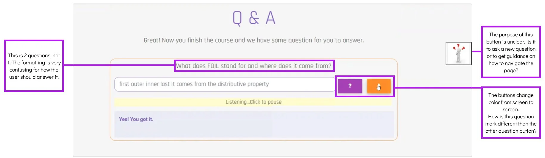
The Existing Product: Functional, But Not Fun
The existing design for MyEdMaster was functional, but it lacked user engagement and clarity. Key features were buried in menus, navigation was confusing, and the overall experience felt more like a homework chore than a helpful tutor.
Based on this, our team identified four key red routes for our redesign:
1. Ask Ed about a topic
2. Answer two topic review questions
3. Answer a practice question
4. Enter your own homework problems
We divided the design work between us due to time constraints. I took responsibility for the sketches for the first two red routes.
The Redesign in Sketches: A More Engaging Learning Experience
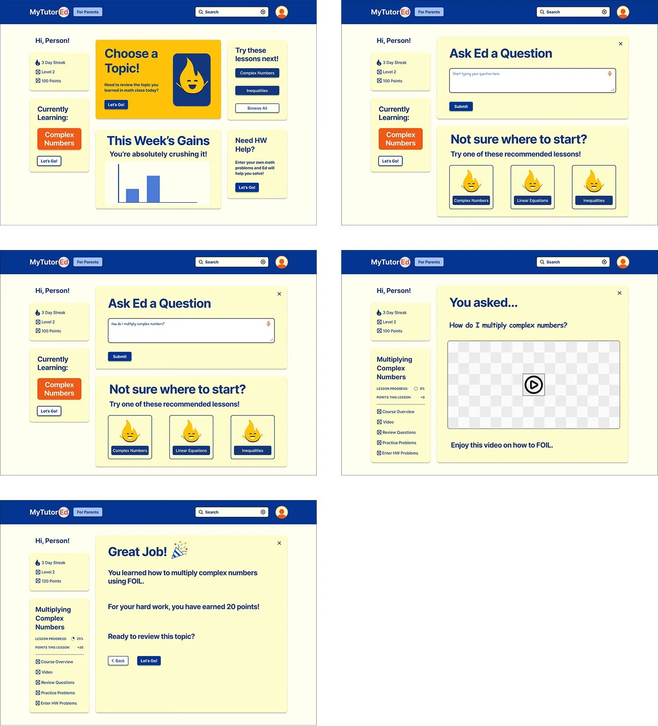
Red Route 1 - Returning User Learns about a Topic
The Dashboard: Everything at a Glance
The biggest improvement we made was the addition of a dashboard that centralizes all of the program's functions. In the original design, users had to navigate through a hamburger menu to find subtopics of Algebra I. This was not intuitive for students. I wanted the dashboard to be a one-stop shop, so I redesigned it with large fonts and easy-to-understand icons that made it student-friendly. This new layout would allow students to quickly access any part of the site without confusion.
Ask Ed a Question: A Smarter, Friendlier AI Tutor
From the dashboard, students would most likely want to start with watching a video and learning about a subtopic. From the dashboard, students could quickly ask "Ed" a question. Ed became the mascot of the platform, making the experience feel more personal. I knew from my teaching background that students often struggle with knowing what to ask. So, I added suggested topics based on a user’s onboarding assessment to help guide their learning and foster curiosity. It’s like having a personal tutor—just without the awkward “do you get it?” moments.
Gamification: Turning Learning into a Game
Gamification was a key goal for our project. I used the point system to reward students for completing tasks, and once they accumulated enough points, they would "level up." This not only made learning more fun but also motivated students to continue progressing. With my experience in education, I understood the power of rewards and how they could increase engagement.
Language and Buttons: Making Every Click Count
One issue we faced early on was the lack of clarity around button functions. When my teammates and I reviewed the initial design, we realized the iconography was confusing. I suggested using clear text labels on buttons—like “Let’s Go!” instead of generic “Enter”—to make the purpose of each action more intuitive and encouraging for students. This small change added both clarity and fun to the user experience.

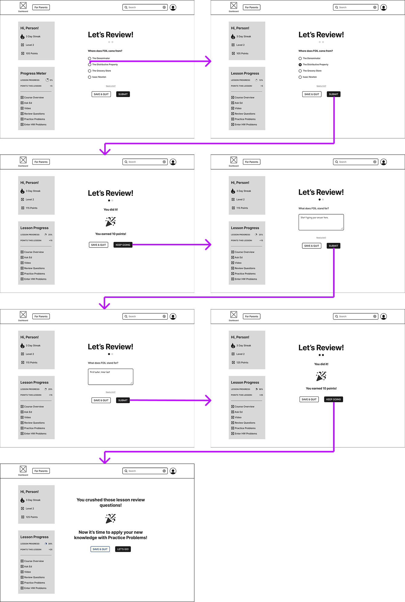
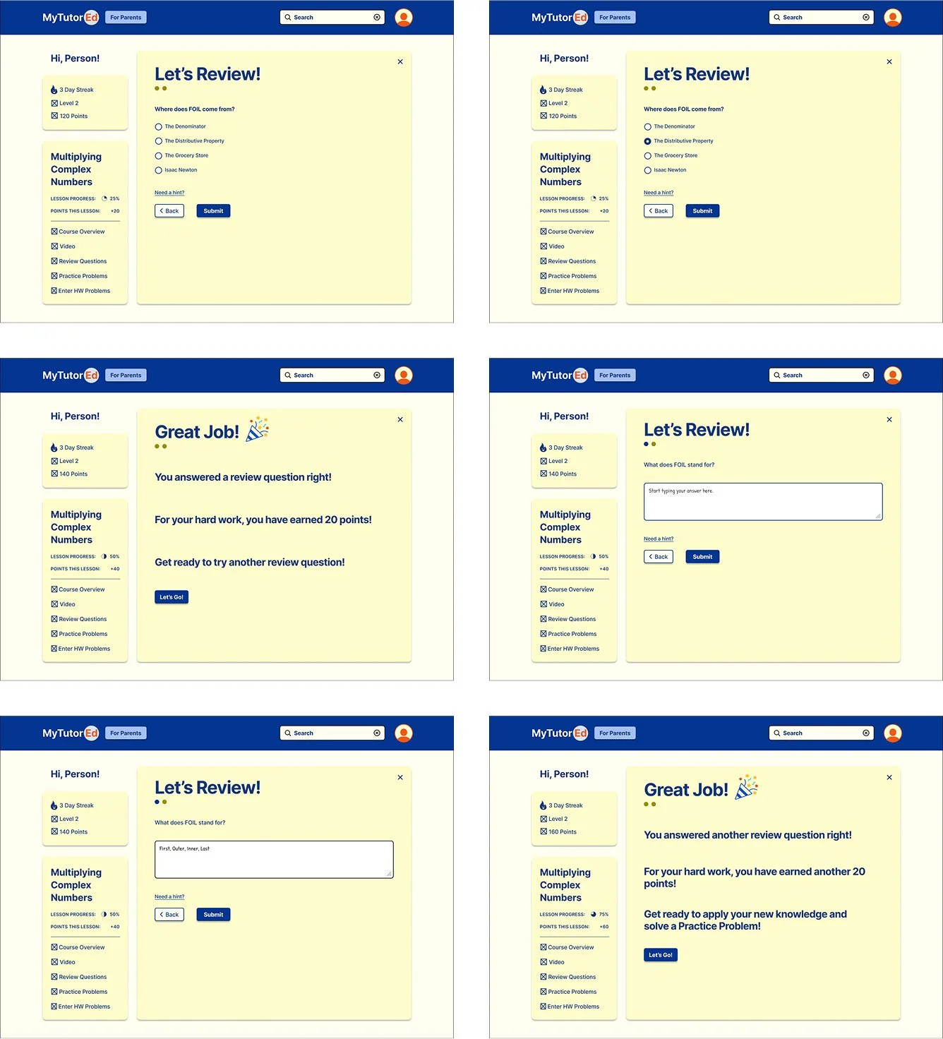
Red Route 2 - Returning User Answers 2 Review Questions
A Variety of Question Formats: Because One Size Doesn’t Fit All
In the original design, the program asks students short answer questions to review the video they just watched. To provide students the opportunity to answer different types of questions, I changed one question to multiple choice and one to short answer. Being able to recognize (multiple choice) and recall (short answer) are both strategies that students should have to answer questions. Additionally, always having only short answer questions could be too difficult for students and ultimately be discouraging. Review questions could also be formatted as true-false or fill in the blank to add diversity and accessibility for students. This approach to question variety allowed students to engage with the content in different ways, catering to different learning styles.

Tapping through Learning: Low Fidelity Wireflows
Red Route 1 - Returning User Learns about a Topic
Side Panel and Progress Meter: Motivation at a Glance
When designing the side panel, I wanted it to include easy access to any part of a lesson and to see any progress. I wanted the consistent reminder for students to see how much they have completed to keep them motivated to do more. This consistent reminder of points and levels also adds to the gamification of learning - a proven effective method of motivation for learners. In addition to the streak, level, and points I had created, my teammate Serena, added on the progress meter, adding even more motivation for students. By integrating these progress trackers, we ensured that students would have a constant visual cue of how far they've come.
Accessibility: Making Learning Inclusive
As a teacher and UX designer, I doubly know the importance of accessibility. One of our design decisions was to incorporate Comic Sans in certain areas, a font known for its readability for students with dyslexia. I wanted students to feel comfortable, and this small tweak helped make the design more inclusive.

Red Route 2 - Returning User Answers 2 Review Questions
A Variety of Question Formats: Because One Size Doesn’t Fit All
In the original design, the program asks students short answer questions to review the video they just watched. To provide students the opportunity to answer different types of questions, I changed one question to multiple choice and one to short answer. Being able to recognize (multiple choice) and recall (short answer) are both strategies that students should have to answer questions. Additionally, always having only short answer questions could be too difficult for students and ultimately be discouraging. Review questions could also be formatted as true-false or fill in the blank to add diversity and accessibility for students. This approach to question variety allowed students to engage with the content in different ways, catering to different learning styles.
Guerrilla Testing Results: Low Fidelity Wireflows in Action
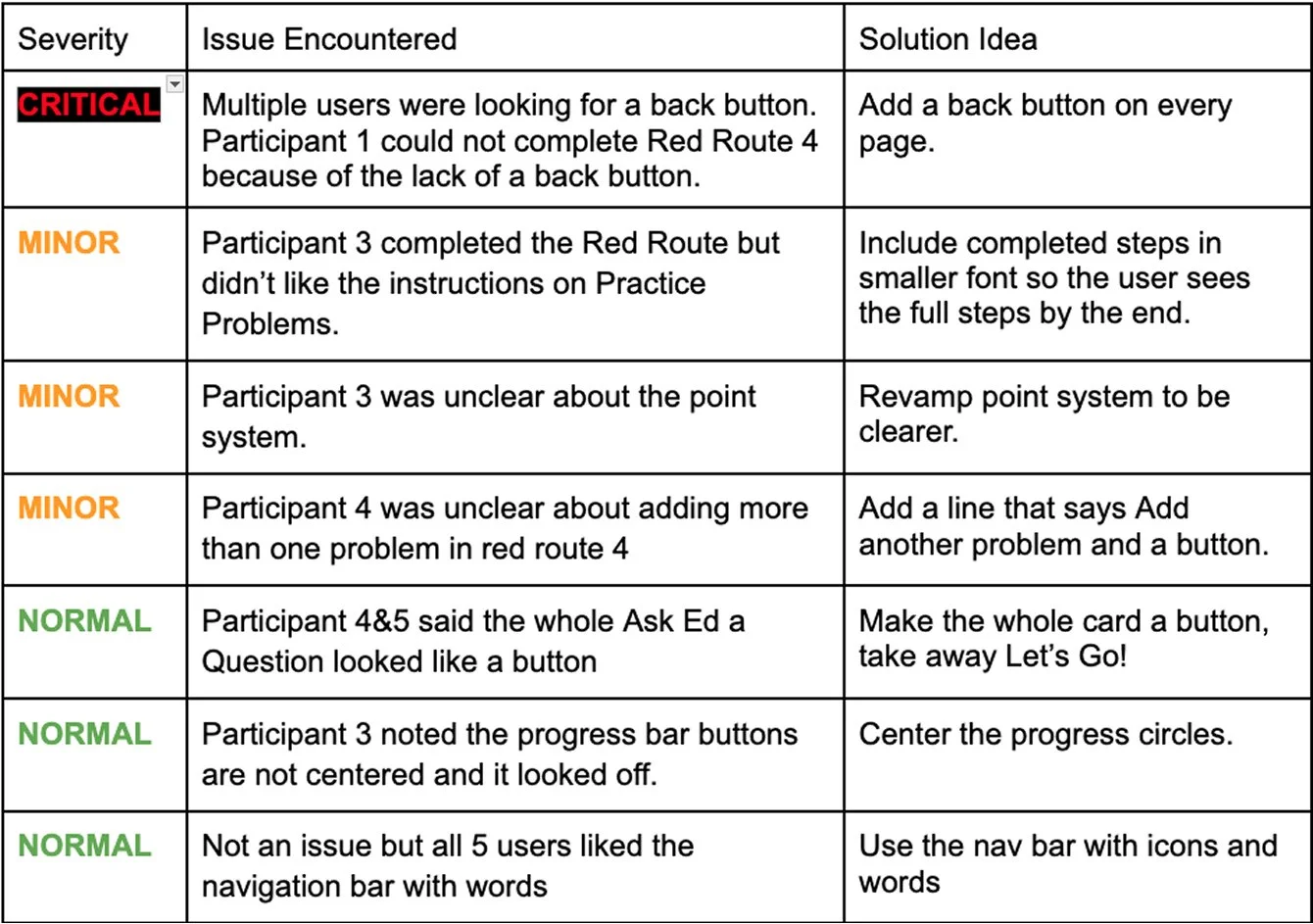
My team members and I each conducted usability testing on our low fidelity wireframes. We each conducted two usability tests and I complied our notes into a summary and then the Problem Log below. The most critical change to be made was to add some form of a back or cancel button.
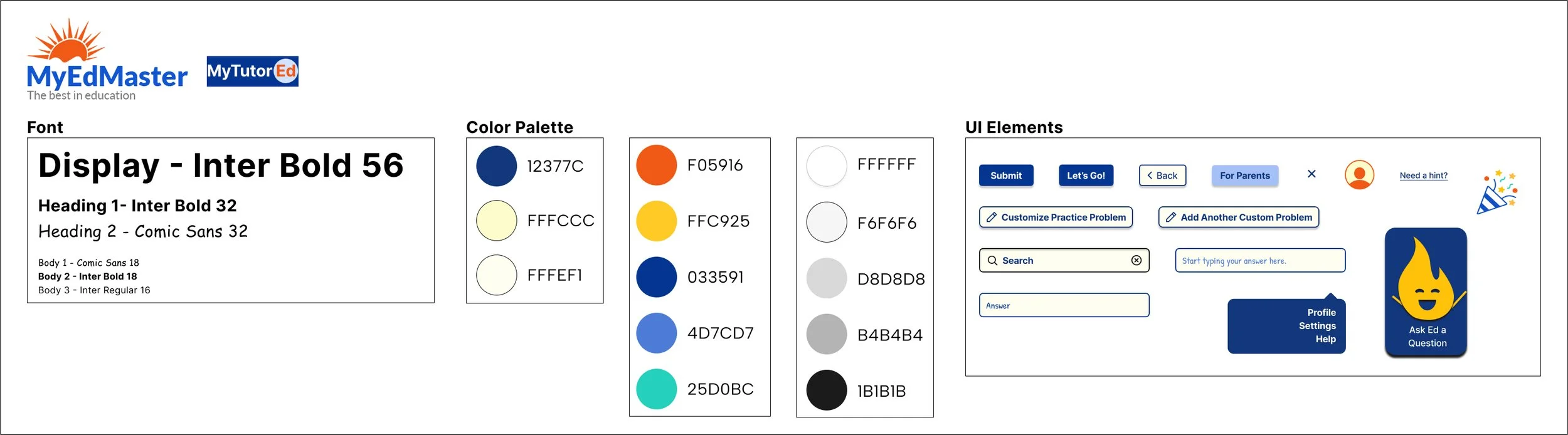
Coloring the Learning Experience: The MyTutorEd Style Guide
MyTutorEd: A New Identity for a New Experience
My teammates and I decided this program needed a new name because MyEdMaster is a company that offers different products and we wanted this tutoring program to be discernible. Playing on the idea of MyEdMaster, I thought of MyTutorEd. Ed in MyEdMaster is short for Education but conveniently is also a name! It works that Ed would also be the guy students ask a question to in the program.
A More Vibrant Look: Colors, Buttons, and Confetti
I chose a color palette based on the orange and blue from the MyEdMaster logo. I made the orange and blue in them darker to give more contrast then built out a couple other colors to keep the colors trustworthy but engaging.
We decided on using Let’s Go and Submit as buttons and removed Keep Going! for consistency. I also customized a celebration confetti icon for us to use each time a student completes a step. Serena had the idea to take our little flame from our streak count and turn him into Ed- our mascot. Ed would be the guy for students to ask questions about and he would be there to celebrate their victories with them. Plus, he can remind them that they are doing great and one might even say, on fire.
From Concept to Reality: Polishing the Design for High Fidelity Wireframes
Red Route 1 - Returning User Learns about a Topic
Optimizing the Dashboard: Smart Navigation
Based on usability testing and team discussion, I refined the dashboard to optimize student learning. The main purpose of MyTutorEd is for students to ask Ed a question so the center and main card should lead them to that action. The cards for the subtopics were confusing to user because the whole card seemed like a button. To address this, i took away the cards and made them solely buttons in the website’s button colors. I also changed the third subtopic to Browse All in case students want to see all the subtopics at a glance.
Personalized Learning: Guiding Students without Limiting Them
Students have the ability to ask Ed a question or browse topics, but if they don’t know where to start, they have a suggested course route based on their assessment taken during onboarding. We also wanted to keep things flexible, students could still explore other subjects at their own pace. In these wireframes, the suggested topic is Complex Numbers, but the student could also choose a different topic if they wanted.
Red Route 2 - Returning User Answers 2 Review Questions
Conclusion: A Teacher’s Perspective on UX
Next Steps
Moving forward, additional testing with real students would provide valuable insights into the effectiveness of the gamification elements and the overall user experience. Further development could include refining the mascot's role in guiding students, expanding the reward system, and incorporating more diverse question types to enhance engagement. The reward system could incorporate badges for special milestones, such as solving 100 homework problems with MyTutorEd.
Learnings
This project reinforced the importance of teamwork, communication, and adaptability in a real-world UX setting. Working with Serena and Andrea highlighted how different perspectives contribute to stronger design solutions. Our ability to divide tasks efficiently while maintaining a cohesive vision was crucial for meeting deadlines within our limited timeline. Additionally, collaborating with an actual edtech company provided invaluable experience in designing for a specific user base and balancing stakeholder goals with user needs.
Overall, this project was an exciting step in my UX journey, blending my background in education with my passion for user-centered design. Moving forward, I look forward to applying these lessons to future projects and continuing to refine my UX skills.
Conclusion
Through this project, my team and I tackled the challenge of improving usability and engagement for MyTutorEd, transforming it into a more student-friendly and interactive platform. By incorporating consistent design elements, gamification, and accessibility features, we aimed to make learning both intuitive and enjoyable for students. Usability testing and team discussions guided iterative improvements, such as rearranging the dashboard for better navigation and refining the question formats to enhance comprehension.
Overall, this project was an exciting step in my UX journey, blending my background in education with my passion for user-centered design. Moving forward, I look forward to applying these lessons to future projects and continuing to refine my UX skills.

Clothing Recycling Program
A Design Sprint for an iPAD Reading App

Redesign of an AI driven EdTech Program