Looped Case Study
The Project

Before designing Looped, I conducted secondary, then primary research to discover a solution to fashion waste and see if people are actually interested in doing something about it.
My secondary research revealed both scary and reassuring statistics about the fashion industry and waste. The average US consumer throws out 81 pounds of textiles a year. This both ruins the environment but every year costs the US $4 billion in management costs. Even with these unfortunate numbers, consumers care. They want to make a difference and they want to shop sustainably.
From my primary research, I built an affinity map, an empathy map, and user personas. From all this information, I derived that consumers want to give their old clothes a new life and they are interested in buying sustainably. However, they want both actions to be easy and efficient.

For my capstone project as part of my Springboard UI/UX bootcamp, I had to solve a problem through researching, designing, and improving on an app of my creation.
Team and Role
With assistance from the Springboard curriculum and my mentor, I held many roles. I worked as the UX researcher and designer, conducting primary and secondary research, designing and prototyping on Figma, and conducting user testing.
The Problem
85% of discarded textiles, whether donated or resold, still end up in landfills.
The good news?
Most of these clothes are actually recyclable and people want to recycle them.
The Solution
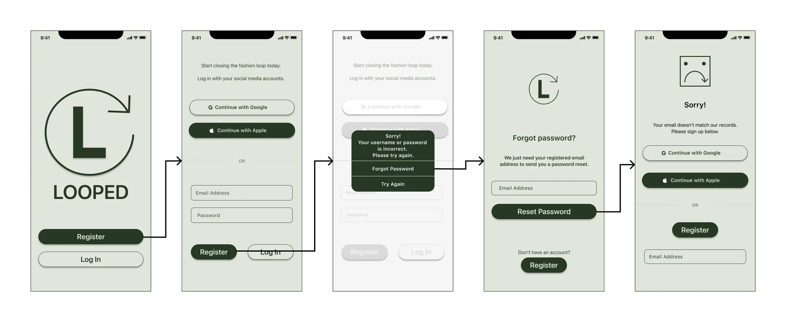
To help alleviate textile waste, I designed the app, Looped, based on a research approach. Looped is an app designed to reduce textile waste by allowing users to recycle unwanted clothing and shop from verified sustainable brands. For $20, users receive a prepaid reusable bag to fill with clothing they no longer need and send it back to Looped. The collected materials are then provided to sustainable clothing companies that genuinely recycle them. Unlike other brands that falsely claim to recycle, Looped ensures transparency and rewards users by crediting their $20 toward purchases from eco-friendly brands. This system encourages responsible shopping while helping to close the fashion industry loop.
The Research Revealed
Early Ideations

After deciding on the model for Looped- send clothes in and buy new ones, I built a user flow. I used this user flow as a guideline for the path of my screens as I designed them.
User Flow
A key word in creating Looped was easy. When I made my sketches, I wanted ordering the bag to send in to be easy and I wanted applying rewards to be easy. I wanted the screens to quickly bring the user to the page to send in clothes. I also thought the easiest name for “the bag you stuff your clothes in to send to us” would be The Bag. Get The Bag, fill The Bag, send The Bag in, get rewarded! I also wanted applying rewards to orders easy. I did not want the user to need to have special coupons sent to their emails or for them to have to hunt down their rewards amount. When they are logged in and checking out, their rewards are right there for them to apply.
Sketches

Red Route 1: First Time User Registering

Red Route 2: First Time User Buying The Bag
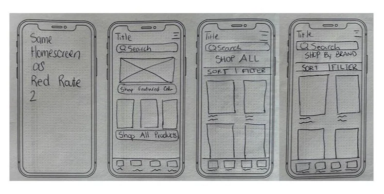
Red Route 3: Return User Using Rewards to Buy a New Item
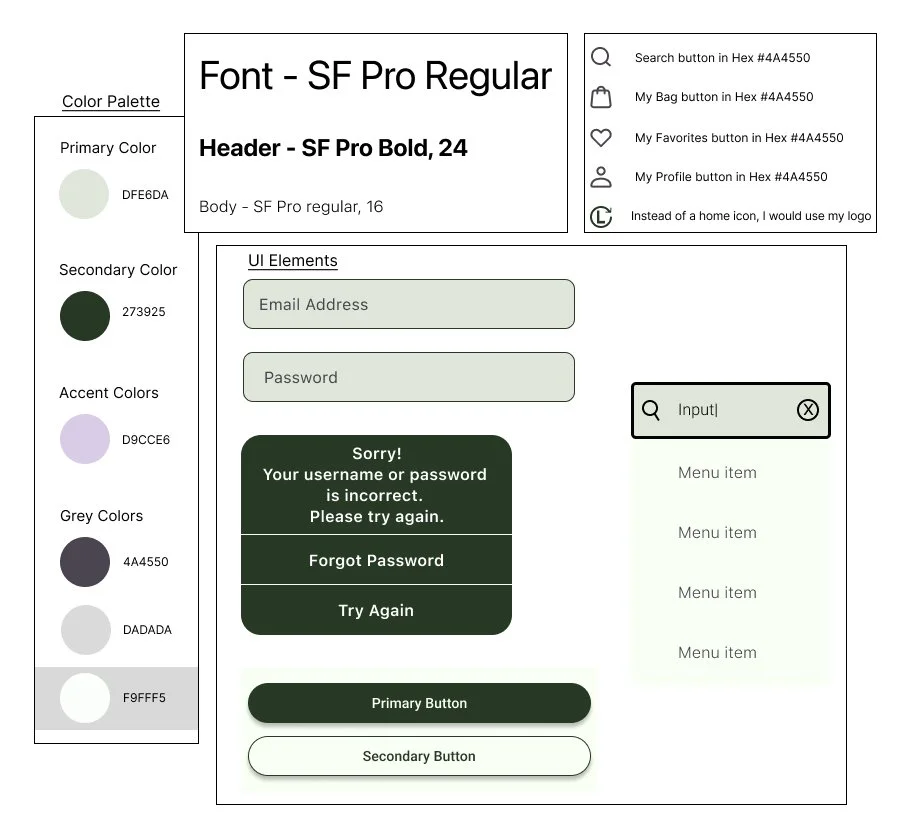
I also created a mood board and style guide to keep me consistent with my design across all screens. After much consideration and palette exploring, I chose a palette centered around a shade of sage green. I went green for the obvious association with being eco-friendly but sage for association of calmness and sophistication. My logo, an L with the arrow in a circle manner represents how Looped is helping to close the fashion loop.
A key word in creating Looped was easy. When I made my sketches, I wanted ordering the bag to send in to be easy and I wanted applying rewards to be easy. I wanted the screens to quickly bring the user to the page to send in clothes. I also thought the easiest name for “the bag you stuff your clothes in to send to us” would be The Bag. Get The Bag, fill The Bag, send The Bag in, get rewarded! I also wanted applying rewards to orders easy. I did not want the user to need to have special coupons sent to their emails or for them to have to hunt down their rewards amount. When they are logged in and checking out, their rewards are right there for them to apply.
Moodboard and Style Guide

High Fidelity Wireflows
After a couple design iterations, I decided on a prototype that I felt ready to send into user testing. I interviewed 5 people, asked them 10 questions, but had 2 main tasks I was looking for them to complete. First, I wanted to see if they understood how to get The Bag to send in clothes. Second, I wanted to test if they could apply their rewards to buy an item.
From this first round of testing, all five people completed both tasks with the screens I had designed. However, as revealed through testing, there was no confirmation page after users hit Purchase. Some users also noted they knew to get The Bag based on context and the task, but they wish there was a little more information about it on the homepage. With this new information and with making some small design tweaks, I created an even stronger version of Looped.
Red Route 1: First Time User Registering

Red Route 2: First Time User Buying The Bag

Red Route 3: Return User Using Rewards to Buy a New Item
Next Steps
After my first round of user testing and iterations, I completed another round of user testing. These users also completed my main two tasks with ease.
In further iterations of Looped, I would include a part of the app with transparency and education. In researching other companies claiming to recycle, I found a lack of proof- who are they using to recycle, where are those clothes going, etc. I also found companies getting caught lying about recycling. I would want Looped to be fully transparent about who the clothes are going to in order to be made into new ones. Additionally, in learning about Looped, users would understand the why behind Looped. Yes fashion waste is bad but just how bad is it and how is it impacting our world?
Learnings
From this project, I learned a lot about textile recycling, but more importantly, I learned about the processes behind UX research and design. Starting from simply identifying a problem, I then completed research and synthesized the information into a report, affinity map, empathy map, and personas. From there, I decided on a solution, built a user flow, designed simple sketches, low fidelity wireframes, high fidelity wireframes, and prototypes. I then learned how to conduct user testing, report on my findings, and iterate to improve my design. Overall, completing my capstone project was incredibly educational and highly enjoyable.
See More of My Work

Clothing Recycling Program
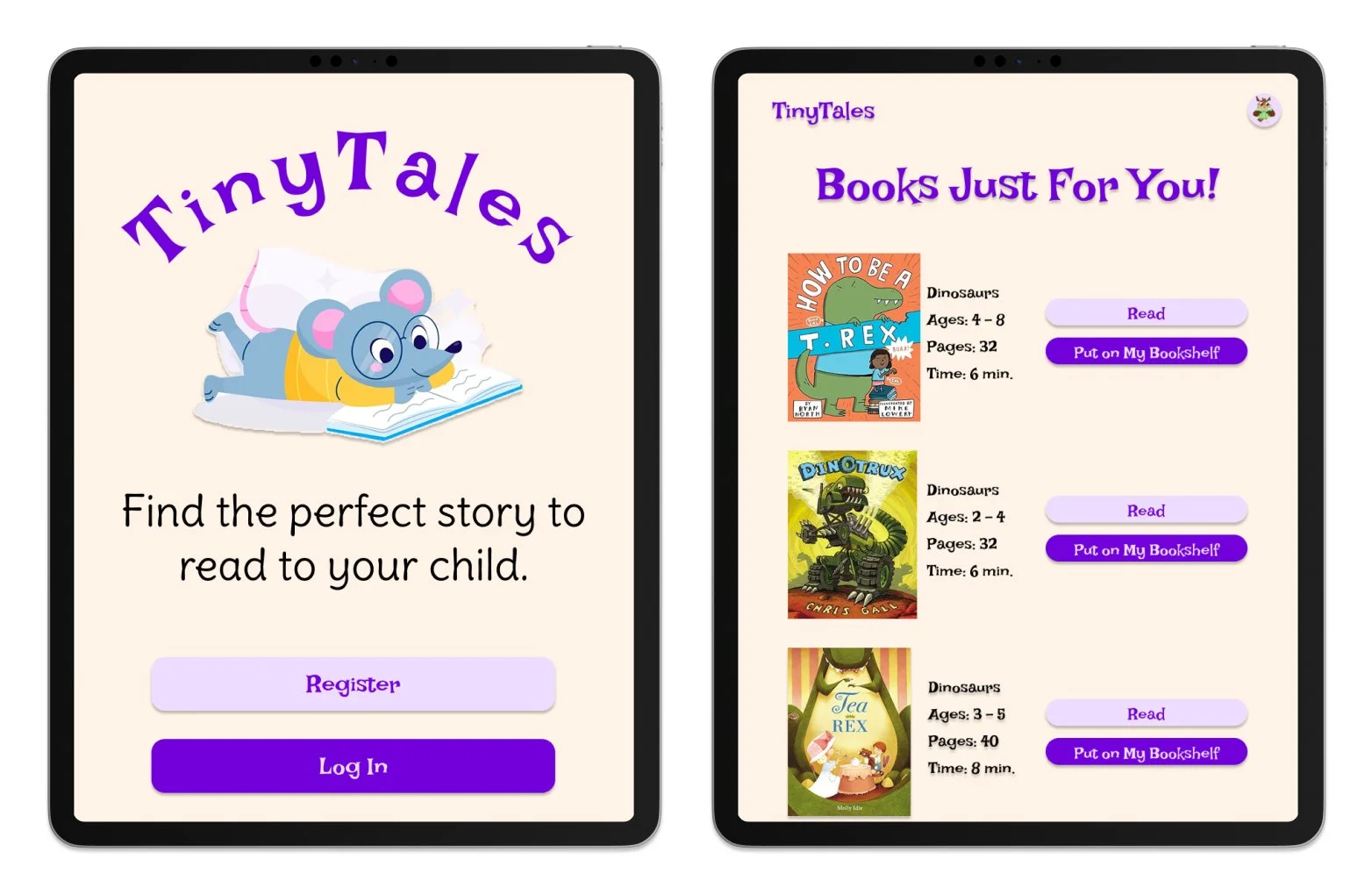
A Design Sprint for an iPAD Reading App

Redesign of an AI driven EdTech Program